PolarGlobe User Manual
Overview
This system provides a user-friendly and comprehensive Graphic User Interface(GUI) for users to view the 4D scientific data. We are providing two types of scientific data in North Arctic for visualization. One is scalar data (temperature data as an example). The other is vector data which is represented by wind data. User can view the scientific data in north arctic and discover the changes of real scientific data through time.
Components
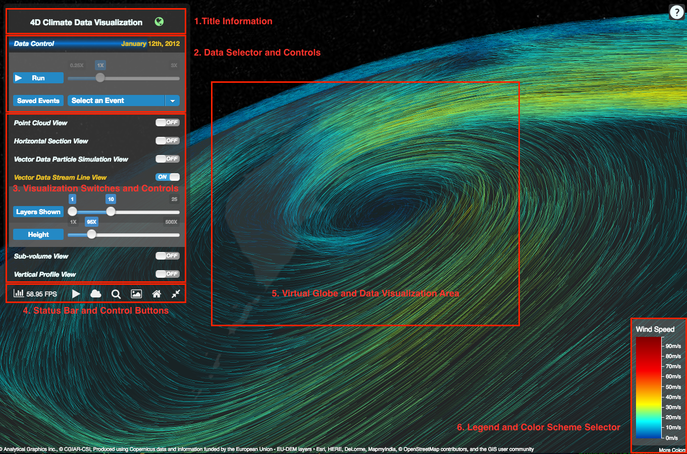
1. Title Information
This button shows the title of this portal. Users can fold and unfold the Data Visualization Switch by clicking this button.
2. Data Selector and Controls
 This panel includes four controls.
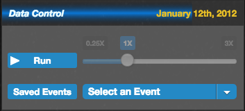
- Animation Progress Bar: the animation progress bar indicates the capture time of the climate data. Users can click the bar and choose to visualize the data of a specific time.
- Animation Switch: the ‘Run’ button in the panel is a switch to control the animation, indicating users to run or pause the animation.
- Animation Speed Control Bar: the visibility of animation speed control comes along with the ‘Run’ button. Users can change the animation speed.
- Climate Event Selector: select and jump to a saved climete event.
3. Visualization Switches and Controls
This panel is composed by many switches used for visualization interaction. Each switch acts as the user interface of a sub-module. The on-off switch on the right can be used to change the visibility of a sub-module. The first four switches are for temperature visualization.
Besides, some of the switches are linked. For example, the siwtch of sub-volume will be automatically turned on if the switch of point cloud view is turned on.
- Point Cloud View
- Horizontal Section View
- Vector Data Particle Simulation View
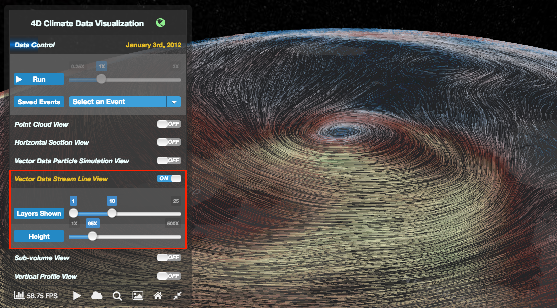
- Vector Data Stream Line View
- Sub-volume View
- Vertical Profile View
4. Status Bar and Control Button
 There are 7 control buttons in the status bar, from left to right they are utilized for:
- Real-time frame rate statistic
- Play/Pause animation
- Save a climate event
- Toggle value picking
- Toggle legend
- Reset camera
- Minimize/Restore control panel
5. Virtual Globe and Data Visualization Area
- The place where the virtual globe and climate data is visualized. Within the area, the virtual globe can be rotated and zoomed in/out using the mouse left button and scroll wheel.
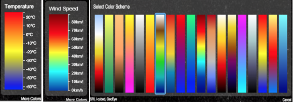
6. Legend and Color Scheme Selector
- Legend of Temperature and Wind The Legend shows the relationship of color and the value of scientific data. It varies with the specific data.
- Color Scheme
The color scheme will be visible by clicking the legend, users can choose any color scheme in the portal.
4D Scalar Data Visualization
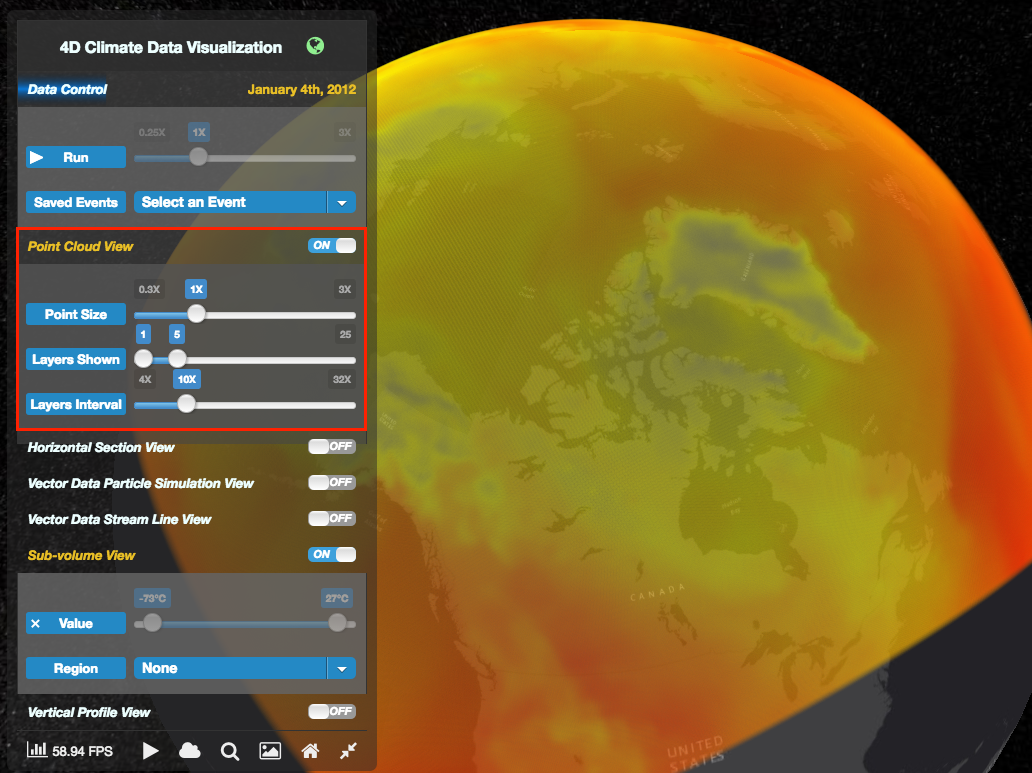
Point Cloud View
This panel is used for controlling the parameters of temperature visualization. The temperature data will be visible on the earth if the users turn on the switch on the top right of the panel. Users can interact with the polar by change the properties of the data. ‘Point Size’ progress bar is used for control the primitive in the scene. ‘Layer Shown’ controls the layer of the temperature data. ‘Layers Interval’ can be used as the control of interval of each layer.
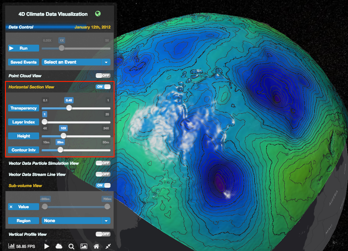
Horizontal Section View
This visualization tool shows variation of geopotential height at some certain air pressure levels. The value of properties can be changed by the progress bar in real-time. That properties include transparency of the horizontal section, layer Index (air pressure level), height of Layer and the interval of contour which is generated on the horizontal profile.
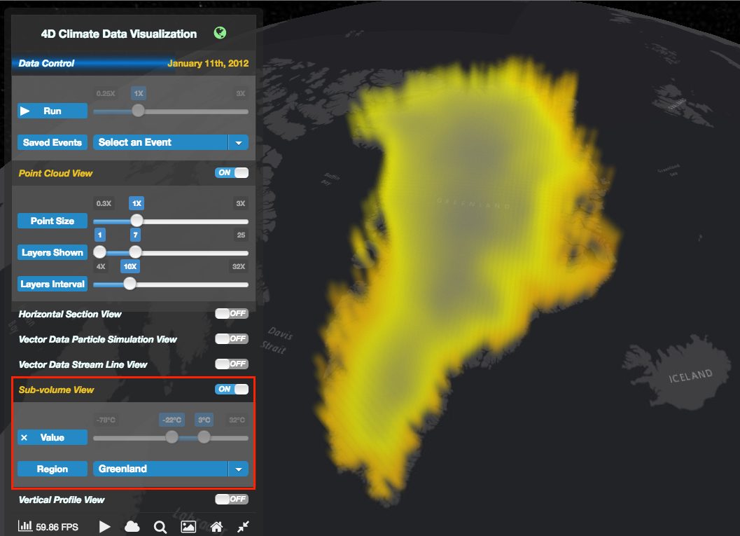
Sub-Volume View
This Panel is used for doing some filtering for the whole climate data. There we use the Point Cloud View (temperature data) as the demonstration. Users can do two filters now. One filter is conducted by the parameter of temperature. The interested temperature range can be picked out with this function.
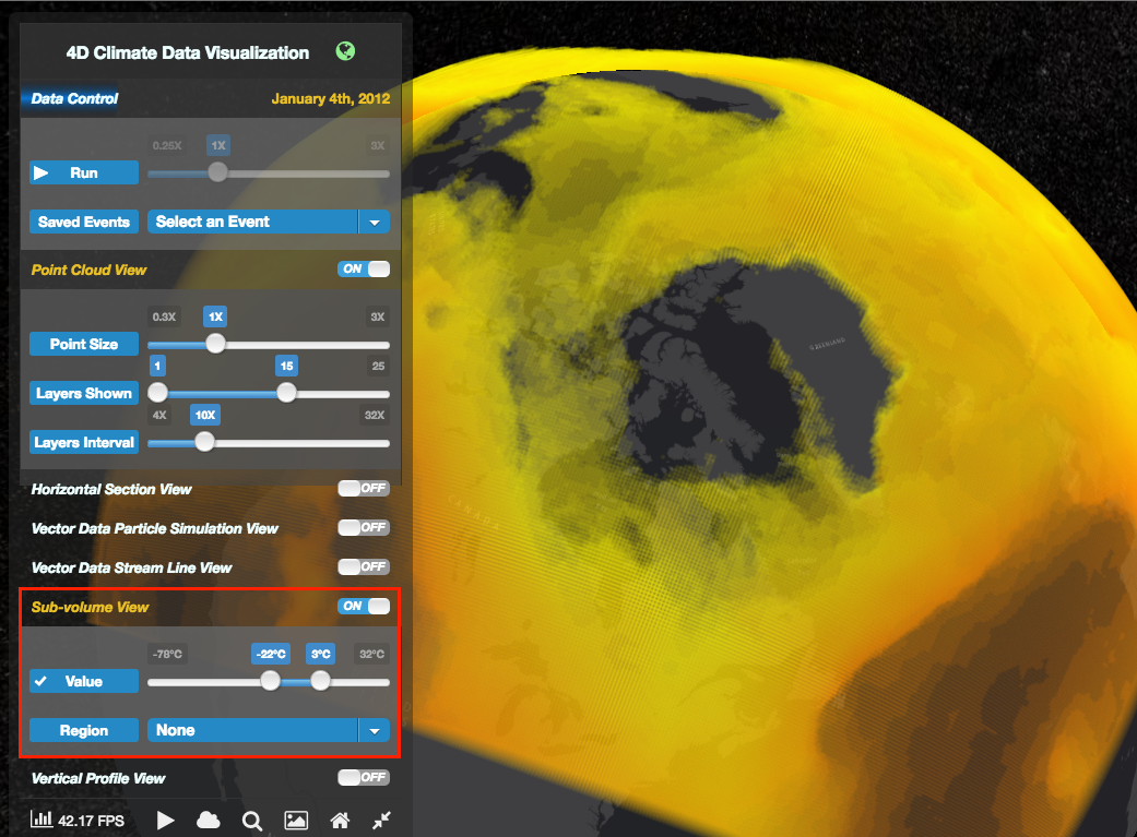 The other one is filtered by region. Users can pick out the temperature data of the specific region, such as Greenland, Alaska etc.
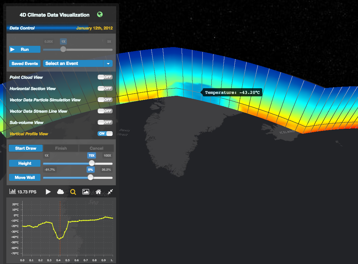
Verticle Profile View
This visualization tool presents the temperature variation in some vertical sections. Users can generate a vertical profile, visually and statistically view the data change in real-time. Here are the steps to draw a vertical profile.
- Click the ‘Start Draw’ button
- Pick up some points on the earth
- Click the “Finish” button, the vertical profile will be generated immediately
- You can click the “Cancel” button if there is a wrong operation in Step 2.
With the “height” slider, Users can change the height of the generated vertical profile. Users can also move the vertial profile back and forth using the "Move Wall" slider.
Click the "value picking" icon in the status bar to activate the value picking function for vertical profile to statistically view the data variation. After value picking is activated, moving mouse in the wall, a balloon will be shown to indicate the temperature value of your pointed place. A horizontal line through the pointed place is drawn as well, the temperature change alone this line is charted in the left-bottom corner of the browser, just below the status bar. In the chart, the red vertial line indicates your currently pointed place. The values in the curves of the chart are equally sampled. They presented as yellow points in the chart, and vertial lines in the vertial profile.
4D Vector Data Visualization (Wind)
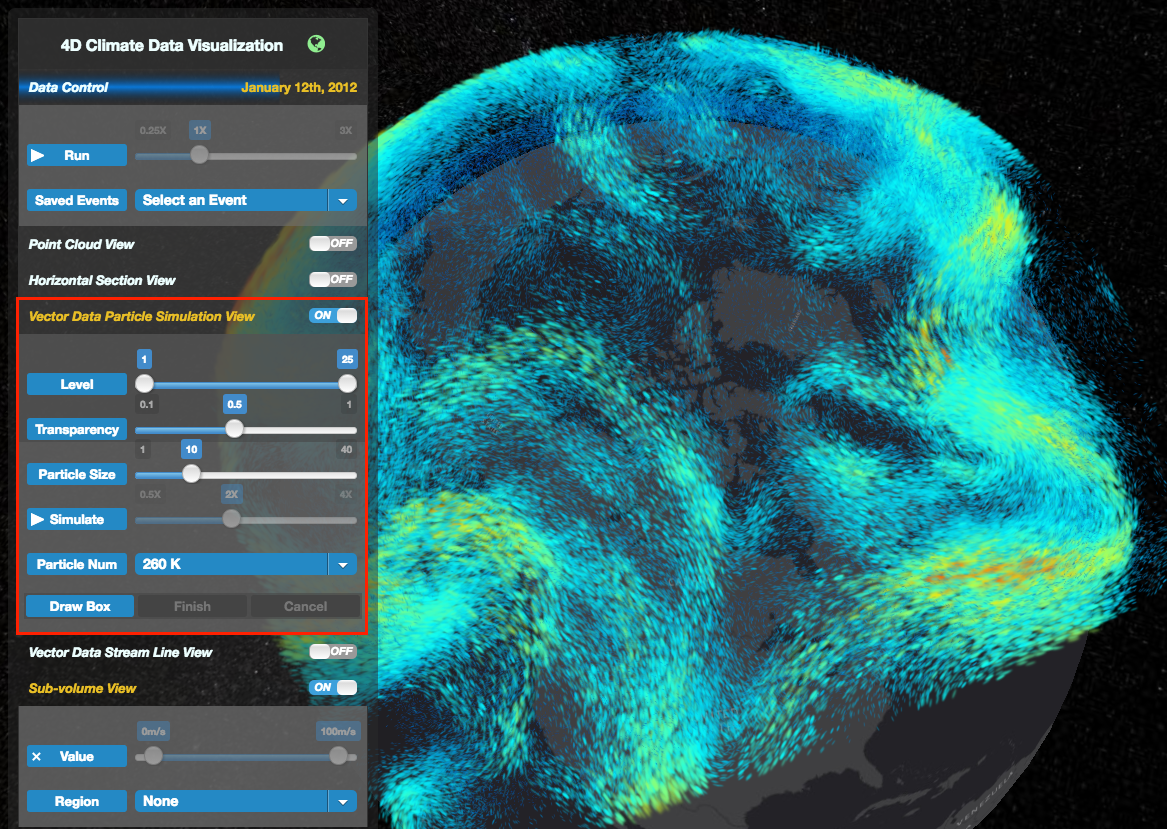
Particle Simulation View
This panel is used for the sub-module of wind visualization. In this polar, wind is represented by thousands of animation particles.
By clicking the ‘Run’ button in this panel, you should animate the wind first.
In this panel, the “Particle Num” combo list is used for control the particle number in the particle system. (‘’65 k = 65536”, “260 k = 262,144”, “1 M = 1,048,576”, “4 M = 4,194,304”)
Users can choose any of the interest layer to view with the progress bar “Level”, such as level 20 to 25. It ranges from 1 to 25.
The next two progress bar is used for particle transparency and particle size.
The ‘Run’ button and speed progress bar is account for particle animation and animation speed.
Stream Line View
This is an alternative visualization tool to simulate the wind data in realtime. Similar to the other tools, the control panel provides two slides to control the visualization behavior. One is the selector of pressure level layers. Another one controls the height magnification of the data.